ROLE / UX/UI DESIGNER & DIGITAL STRATEGIST
THE CHALLENGE
Uptrends’ rapid growth had created duplicate components, inconsistent patterns and unnecessary friction between design and development. The ecosystem needed structure.
THE PROCESS
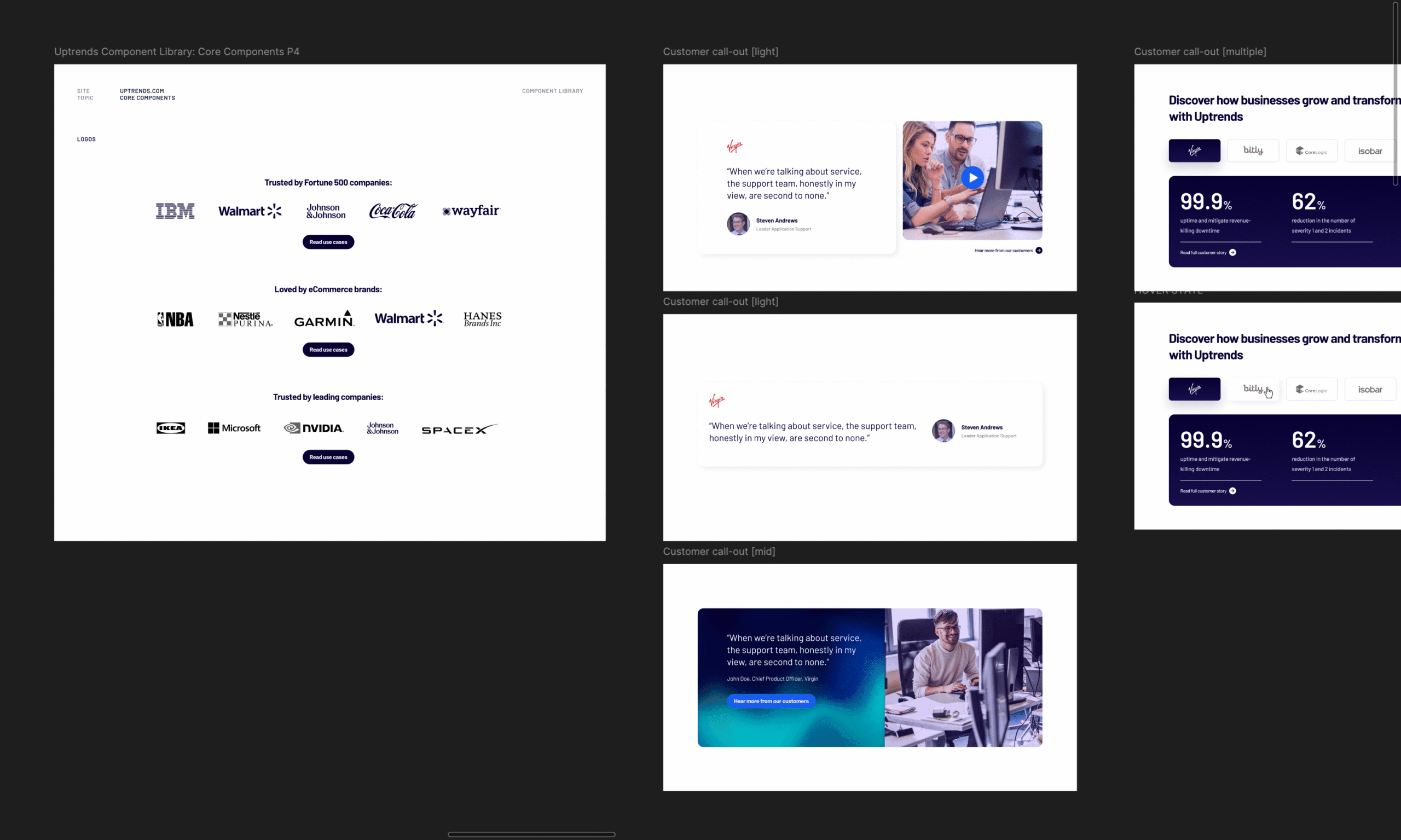
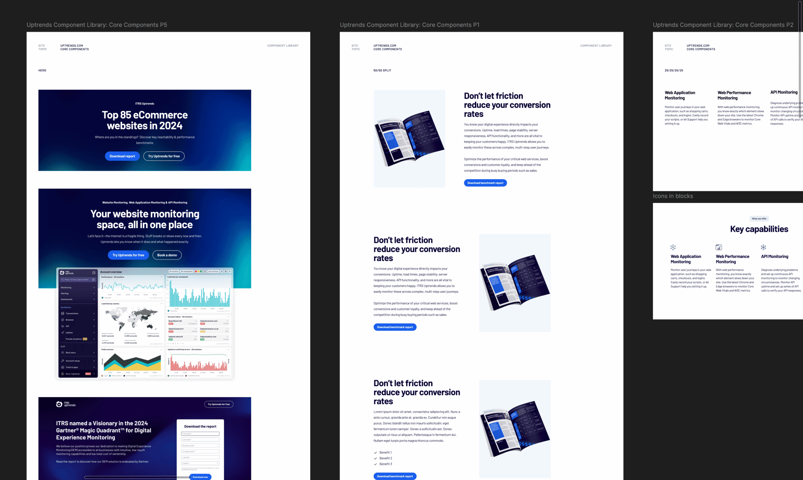
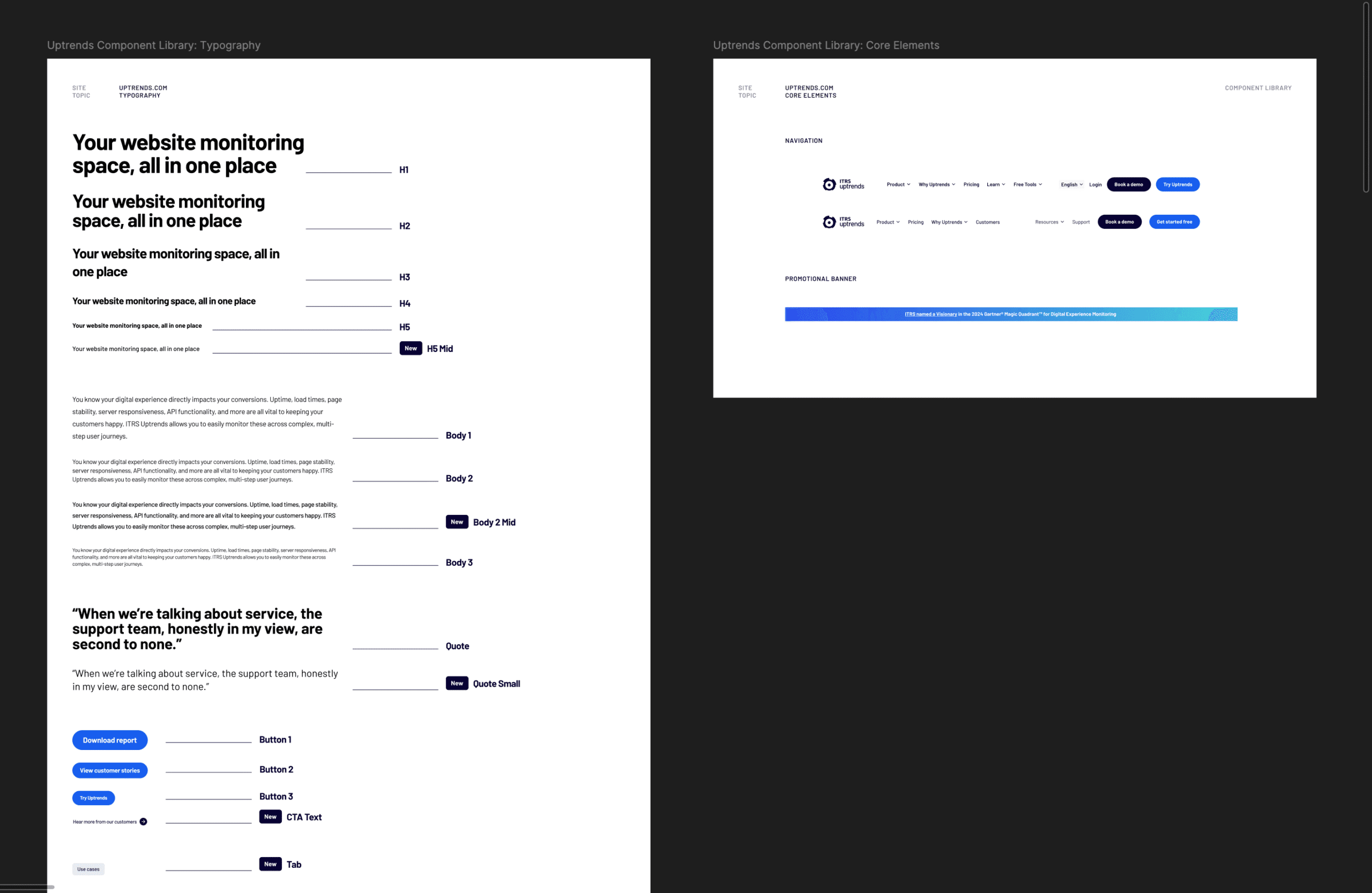
A comprehensive UX/UI audit mapped inconsistencies and recurring patterns. From there, a token-based architecture was defined. Atomic components were built and tested across live scenarios. Documentation ensured usability beyond the design team. Governance was built in from the start.
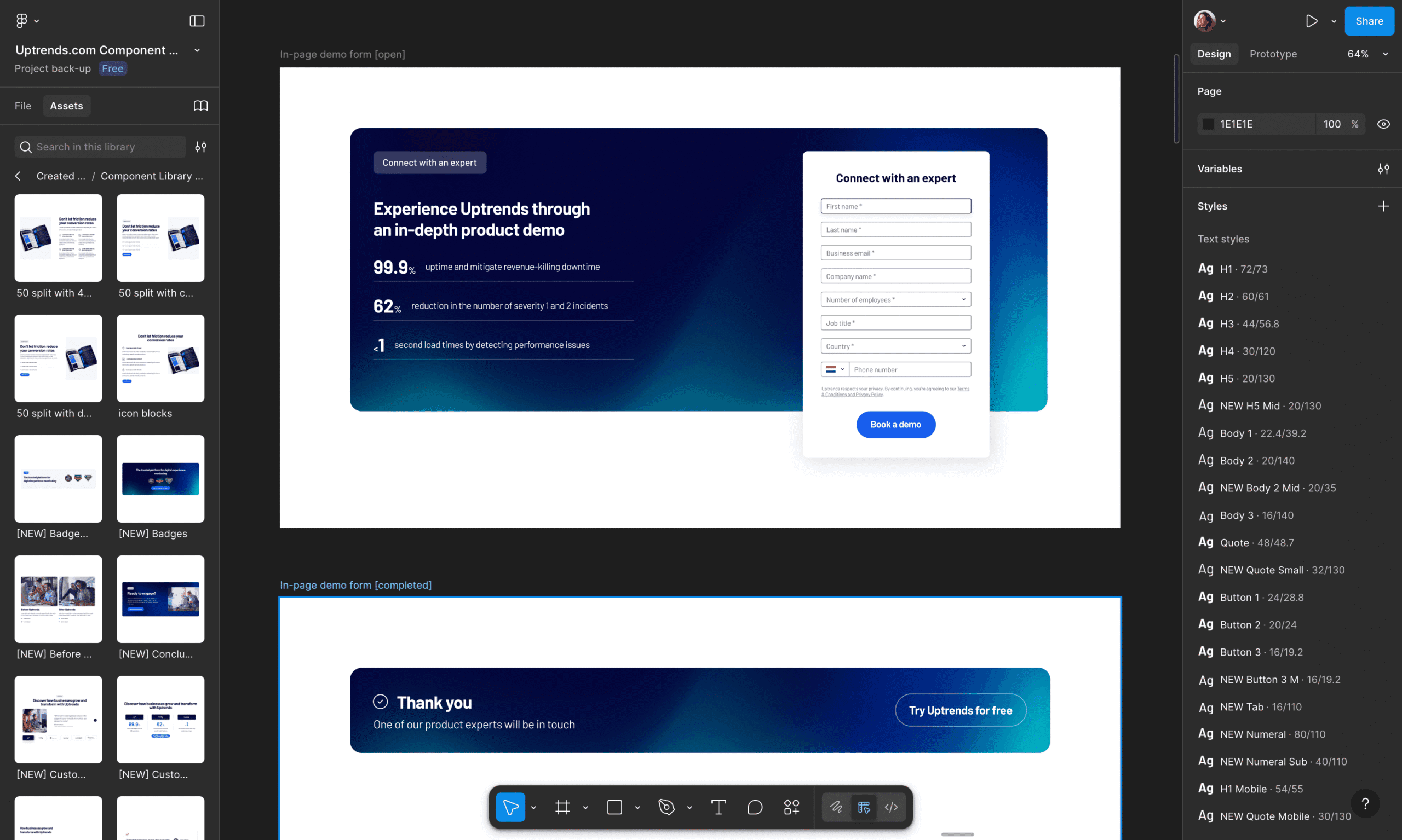
THE SYSTEM
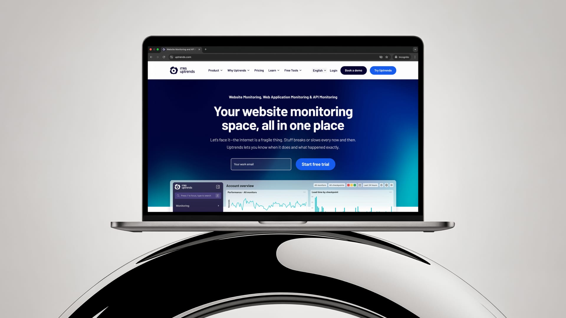
Colour, typography and spacing tokens were formalised. Reusable components and templates were centralised in Figma. Clear usage guidance supported adoption across teams. Consistency became the default, not the exception.
FIGMA SNAPSHOTS
THE IMPACT
Workflows accelerated. Duplication was reduced. Brand cohesion came to life. Uptrends now operates with a scalable system designed for sustainable digital maturity.
TECH & CORE SKILLS
– Figma design systems leadership
– Atomic design methodology
– Token documentation
– Responsive UX/UI systems
– Cross-functional alignment
– System governance


Selected works

Fellowmind's evolution as a digital partnerDigital Experience, Branding & Campaign

Wavin's innovative sustainability product breakthroughDigital Platform

LeasePlan's transition to what's next in sustainable mobilityBrand Realignment

Elevating Spacetalk's vision of connected familiesDigital Campaign & Content

ITRS as a leader in AI-powered real-time monitoring solutionsDigital Experience & Branding

Defining impact for Toyota Finance's sustainability roadmapInfographics, Data & Strategy
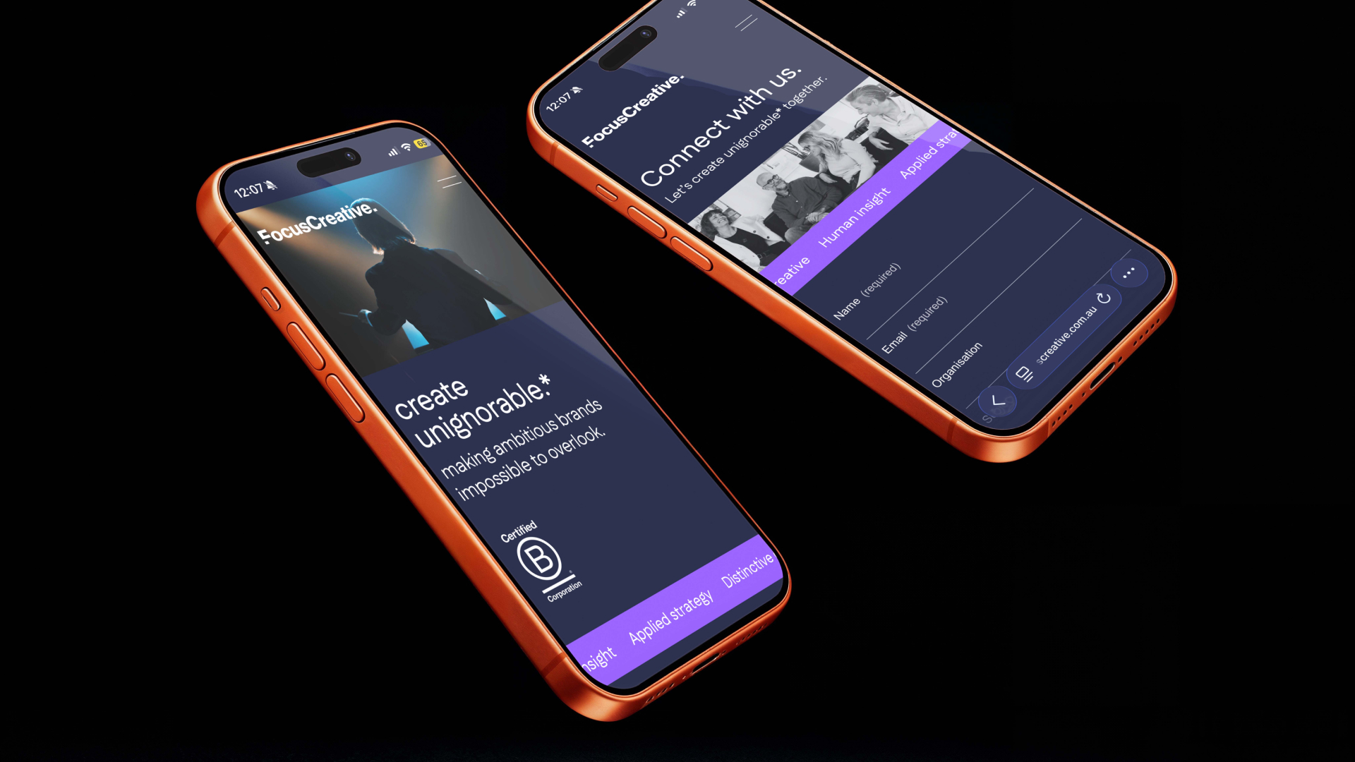
Sharpening Focus Creative's edge in a crowded marketDigital Experience & Branding
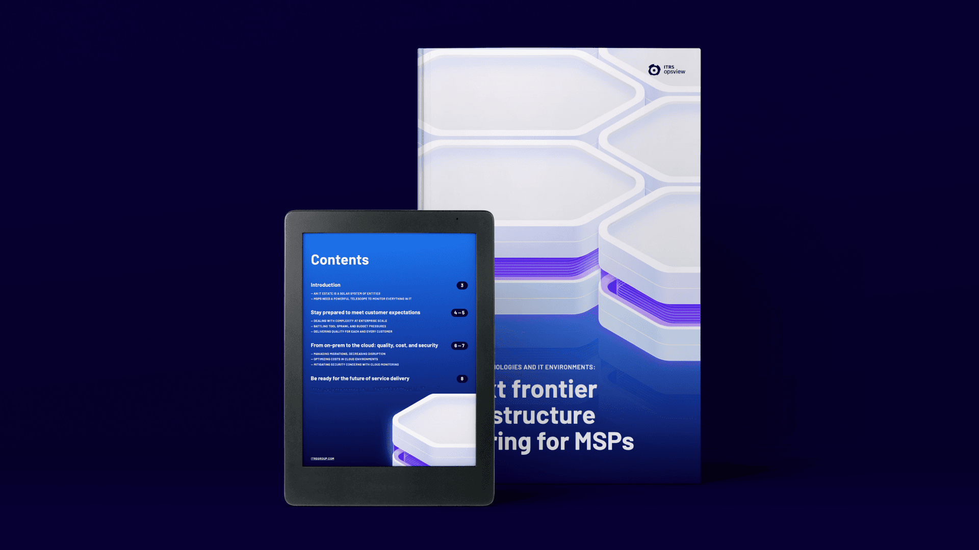
Establishing ITRS Opsview as the go-to for MSPsDigital Campaign & Content

PhotographyLove Stories, People & Places